Ukiah Brewing Company
Clarifying a legacy brewery through place, restraint, and a scalable packaging system
A packaging and brand evolution designed to complement Ukiah Brewing Company’s existing identity while supporting future retail growth.

Setting the Stage
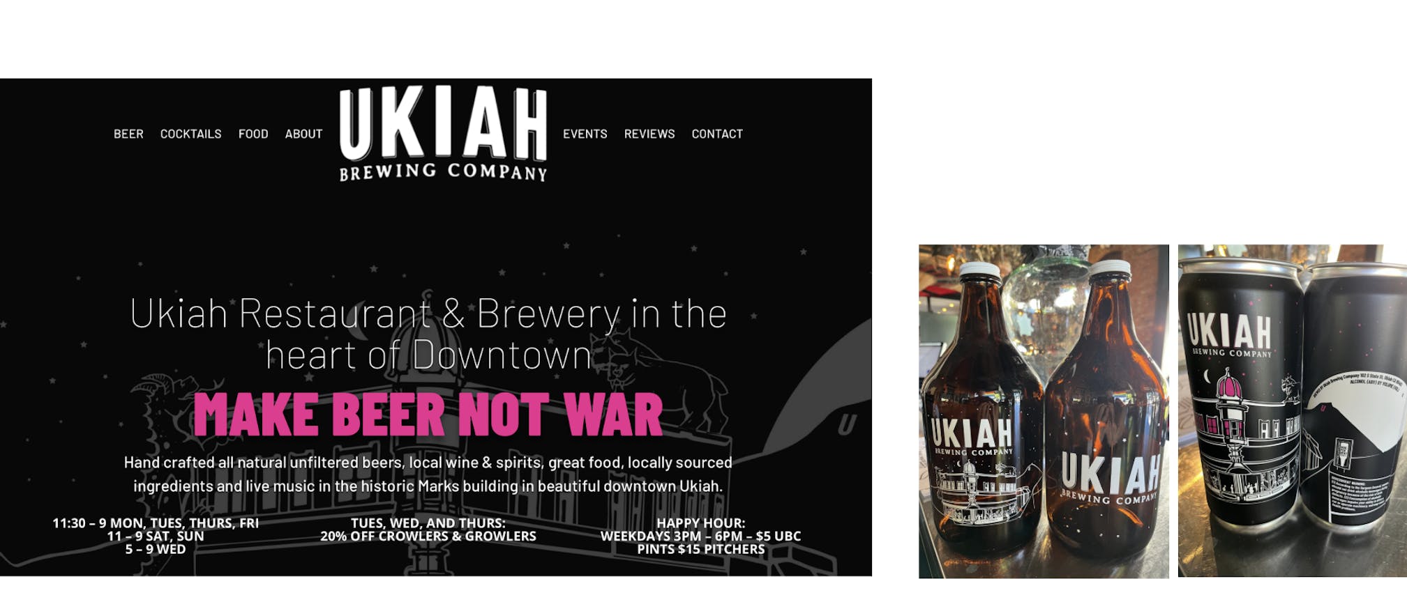
Ukiah Brewing Company is a Mendocino County craft brewery and restaurant with more than two decades of history and a deeply rooted local presence. Under new ownership, the brewery had been investing in beer quality, operations, and long-term growth, creating an opportunity to think more intentionally about how the brand showed up on shelf.
This project wasn’t about replacing what already existed. Instead, it focused on clarifying how packaged beer could express the same sense of place, care, and character that defined Ukiah’s taproom and community presence.
Context and Opportunity
Ukiah already had strong local recognition and a visual language rooted in its history as both a brewery and restaurant. Existing touchpoints, from the website to growlers, bottles, and early cans, reflected that blend of experiences.
Rather than critiquing those materials, the work began by identifying an opportunity: to create a clear, cohesive packaging system that could live comfortably alongside the existing brand while bringing greater consistency, shelf presence, and longevity to packaged beer.

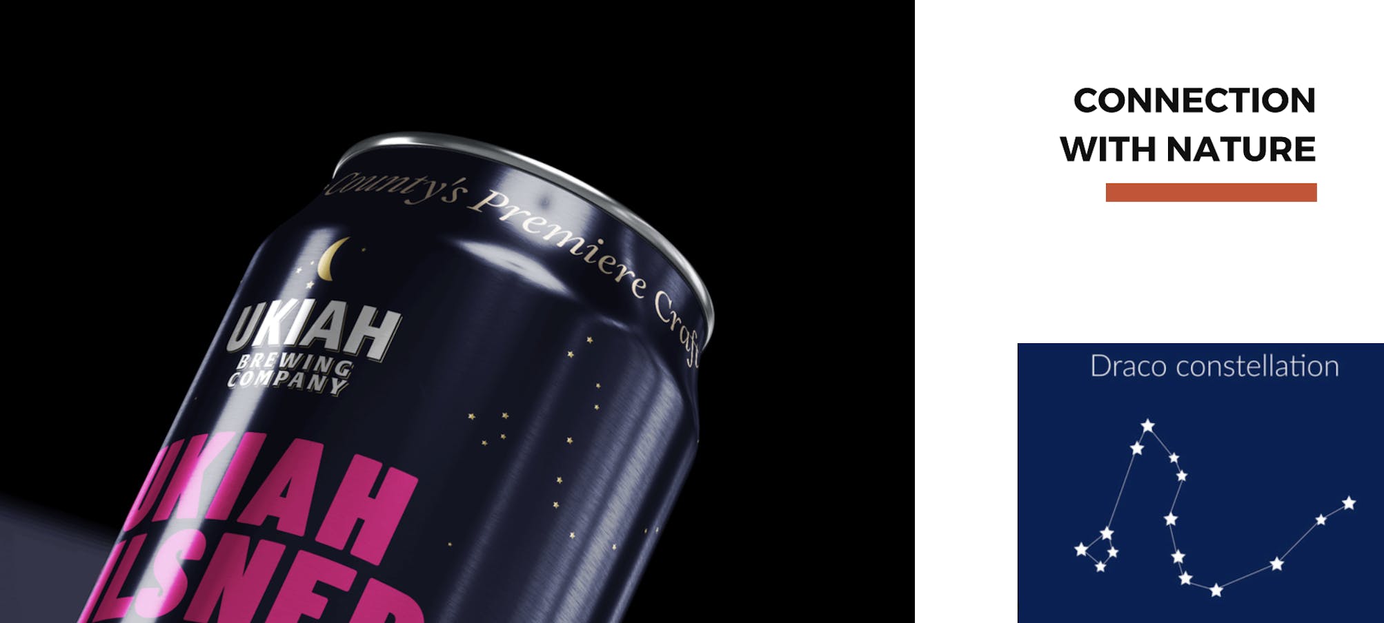
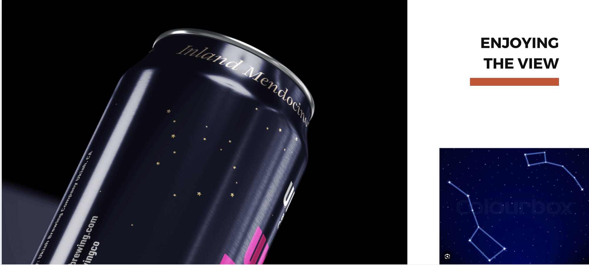
Strategy: Mendo Time
At the center of the work was a guiding idea: Mendo Time.
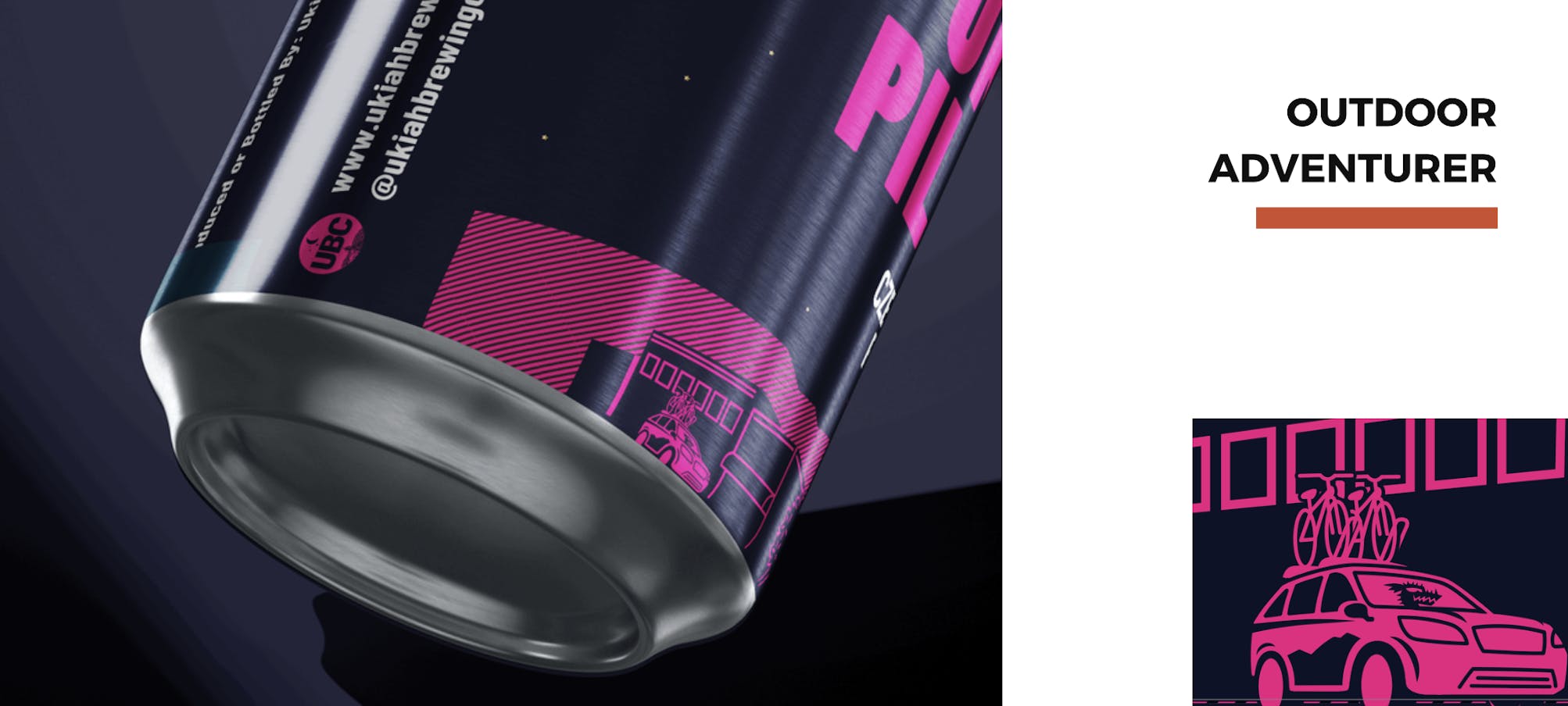
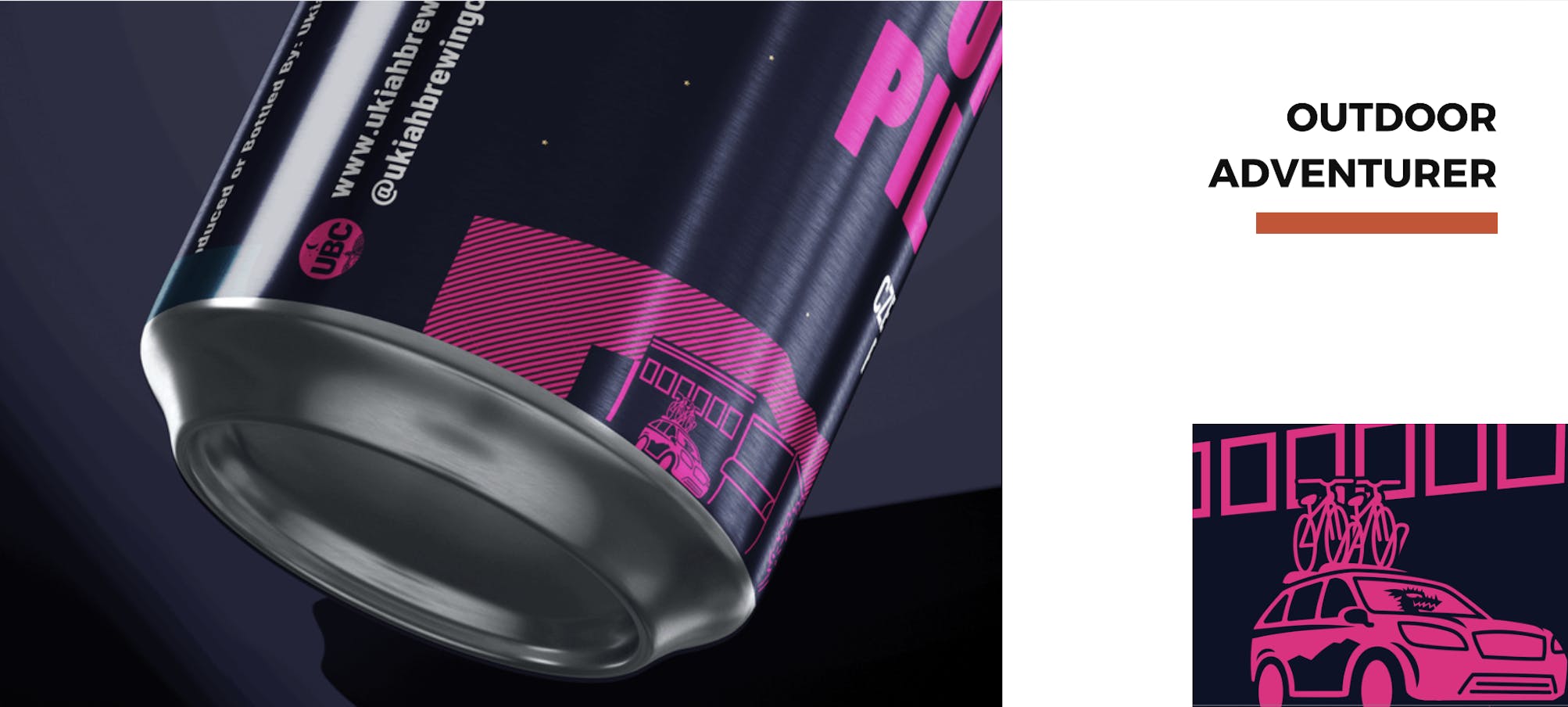
Mendo Time reflects the slower, more intentional rhythm of life in Mendocino County; long evenings, clear night skies, and a culture that values craft and balance over urgency. Rather than leaning on familiar outdoor clichés, the concept draws from lived experience and atmosphere.
This idea shaped decisions across the system, influencing tone, hierarchy, color, and restraint. The result is packaging that feels confident without being loud and regional without becoming nostalgic.
Brand Evolution, Not Reinvention
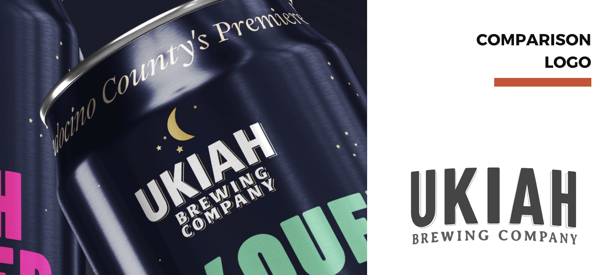
Ukiah Brewing Company’s existing logo carried familiarity and equity, so the goal was refinement rather than redesign.
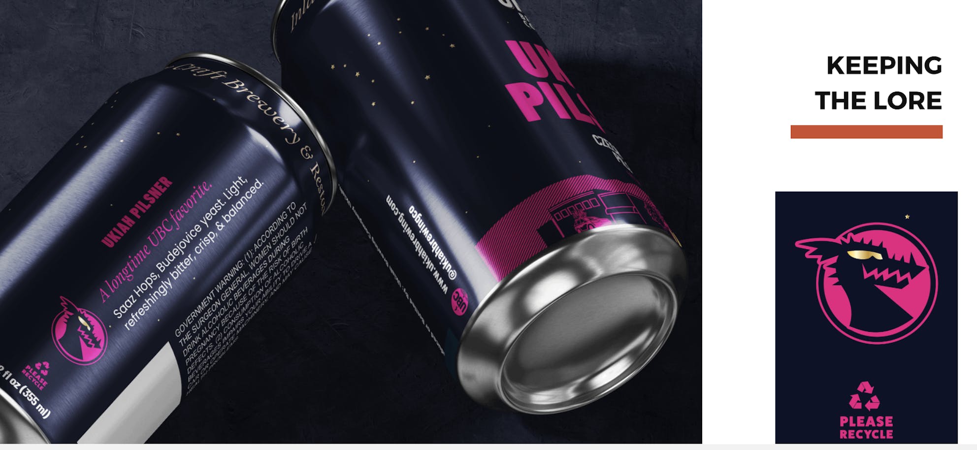
The wordmark was subtly adjusted for balance and clarity, then expanded into a flexible family of lockups and emblems. This provided a broader visual toolbox to support packaging, merchandise, and future applications, while remaining recognizably Ukiah.
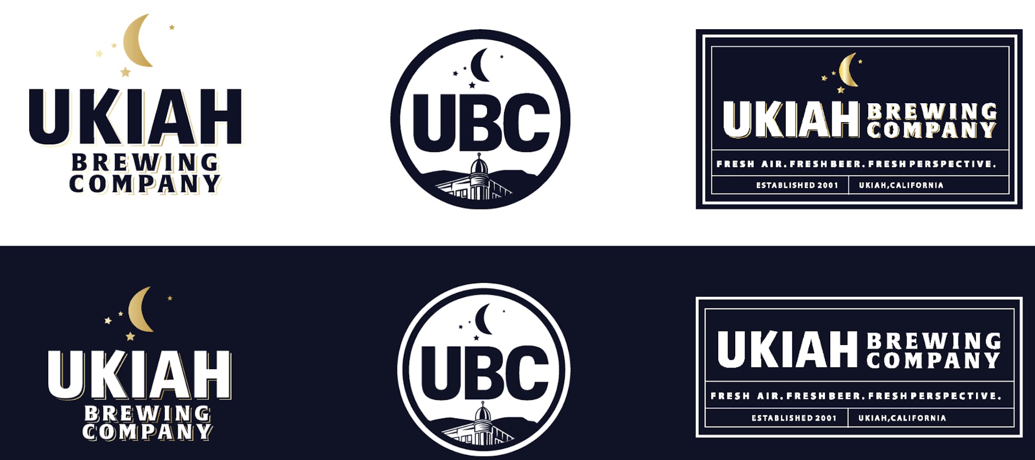
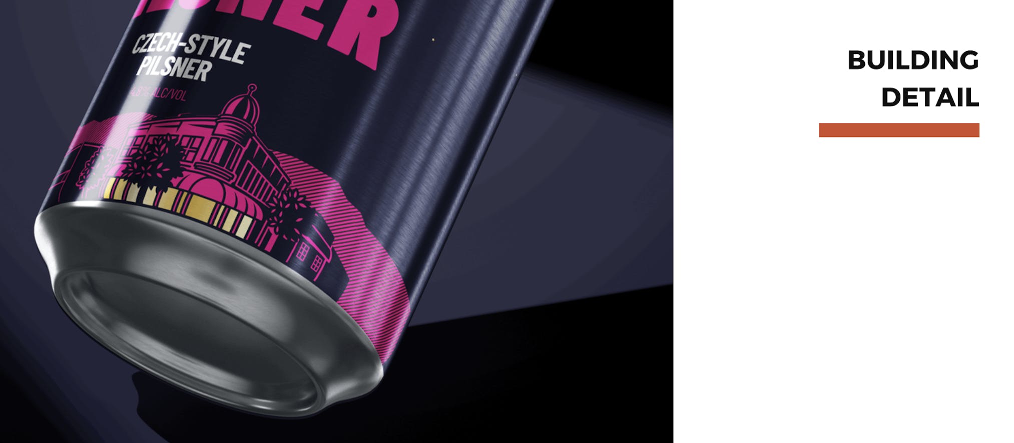
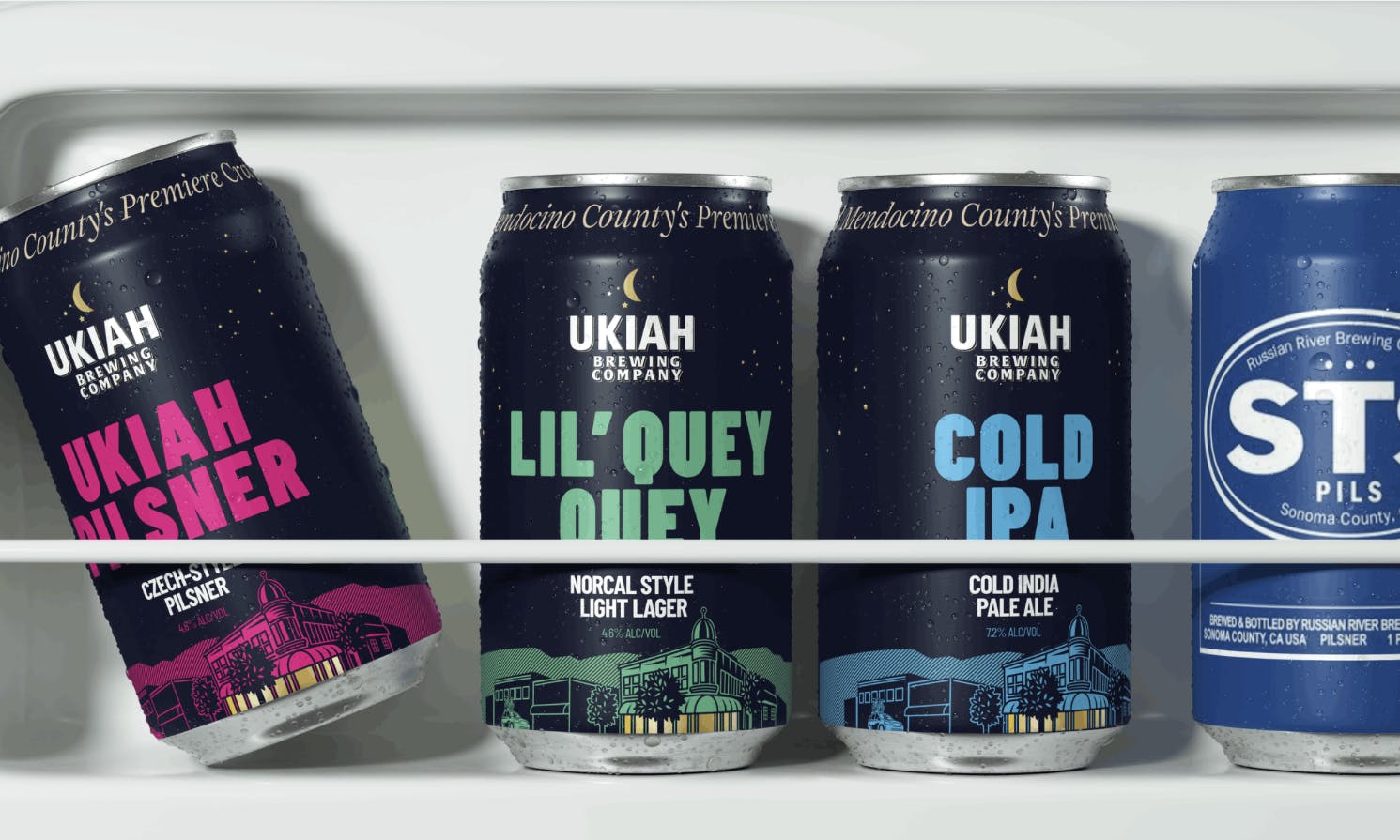
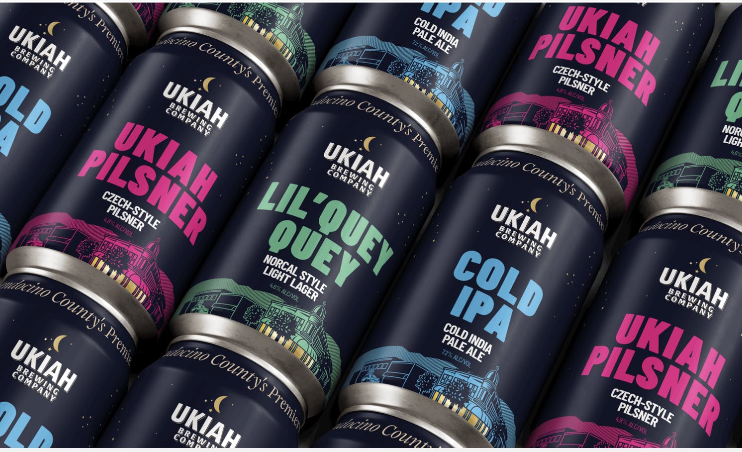
The Packaging System
The core packaging system was designed for immediate shelf clarity and long-term scalability.
Each can follows a consistent structure, allowing typography, hierarchy, and illustration to remain cohesive across the lineup. Color is used deliberately to differentiate styles, creating strong contrast and quick recognition without visual clutter.
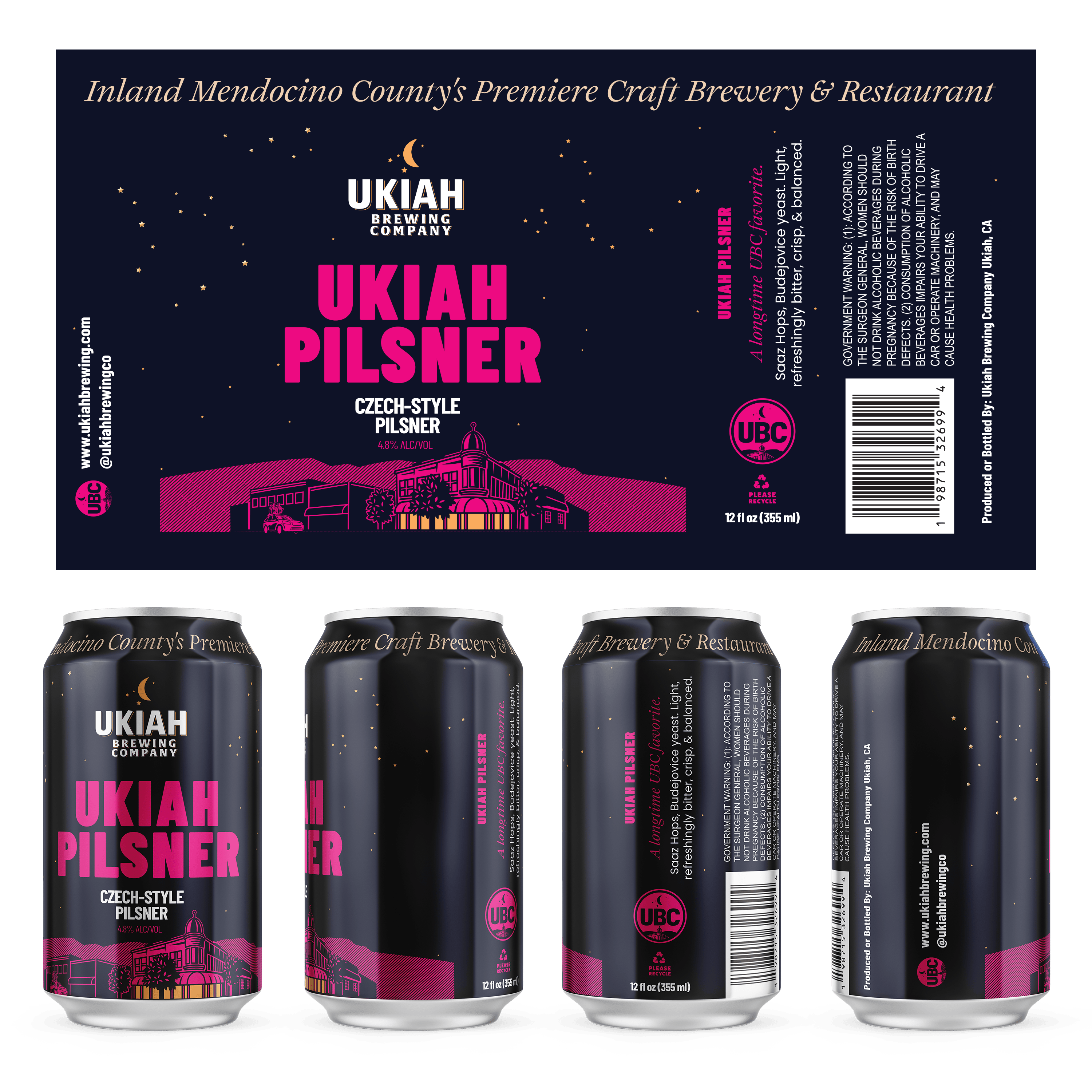
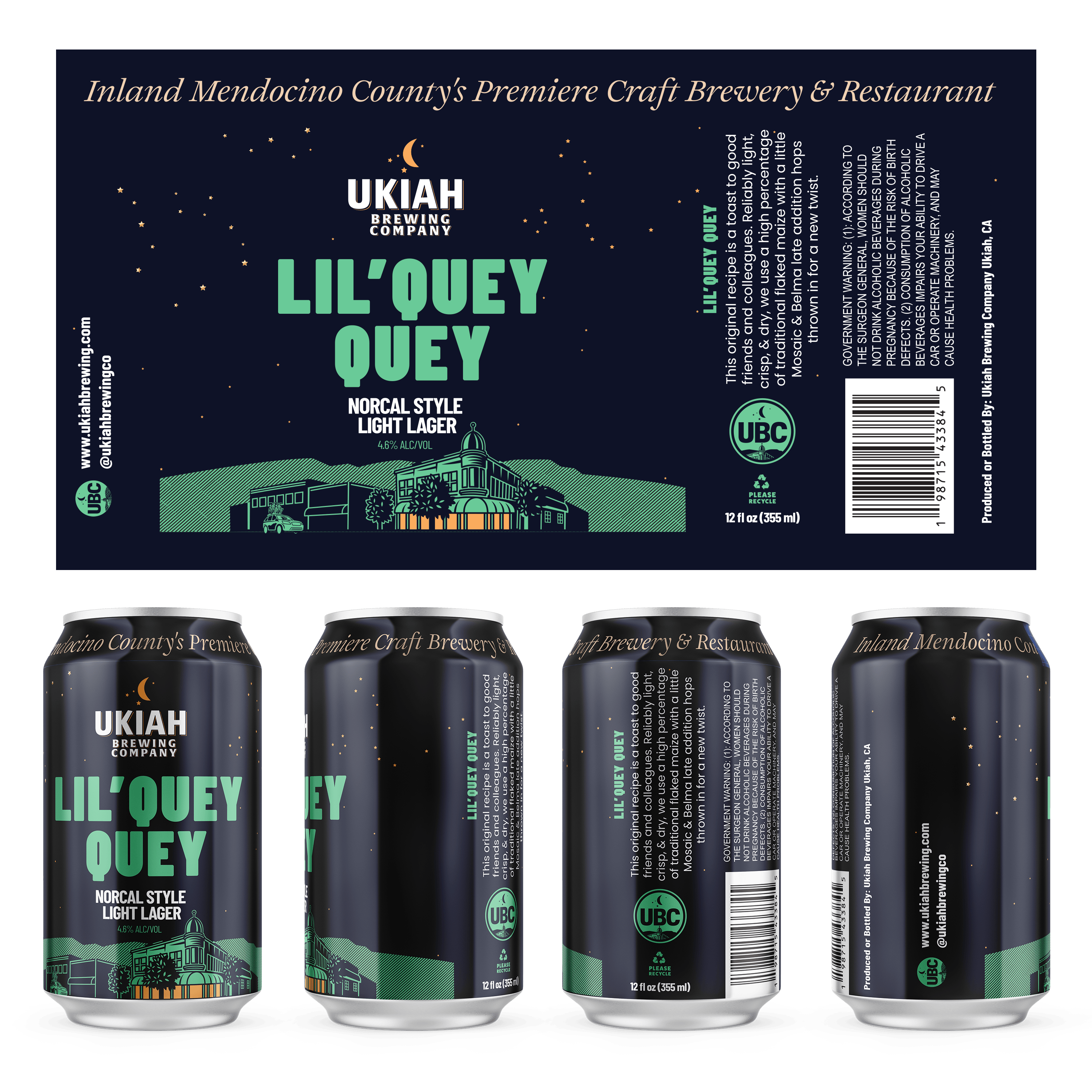
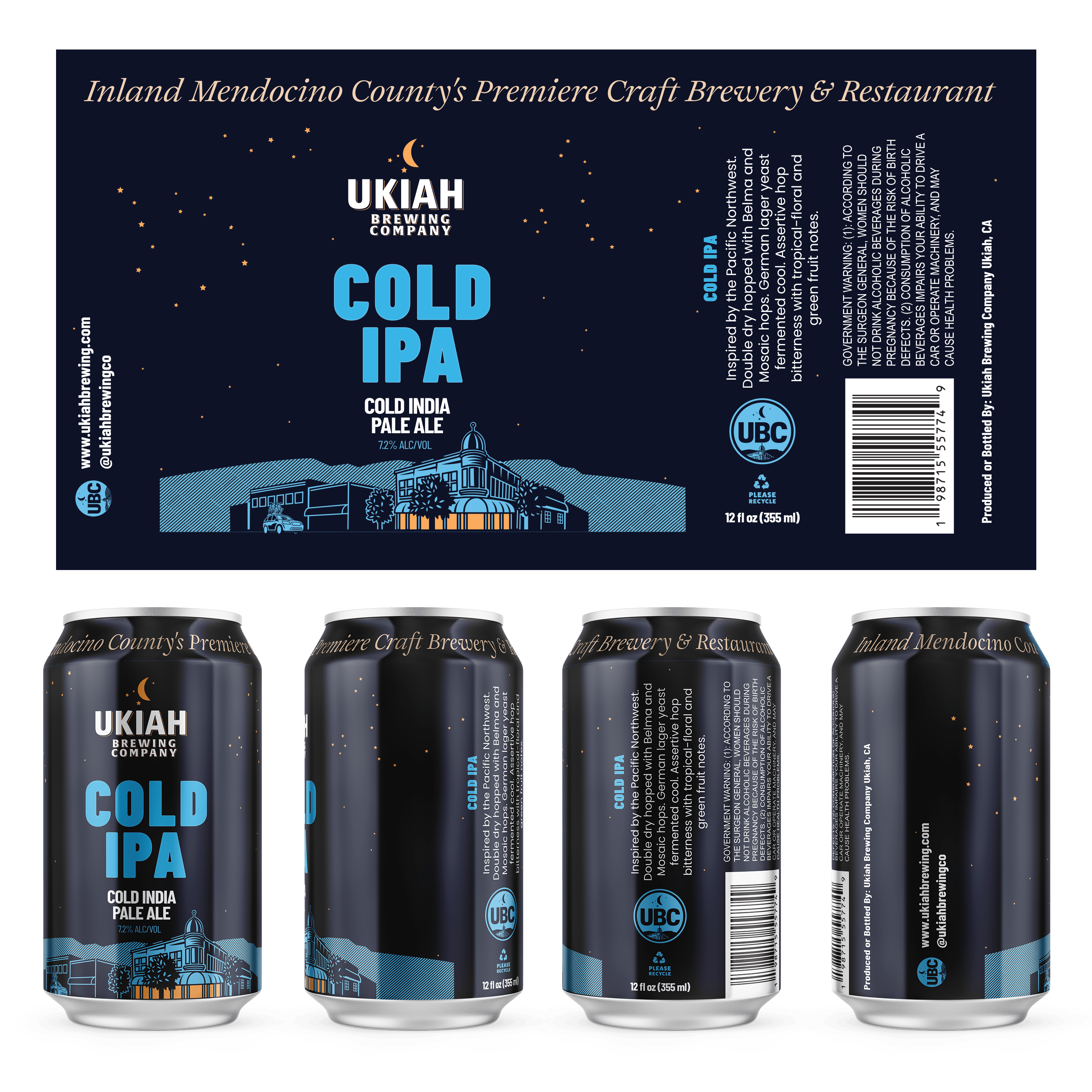
Designed for the Real World
The packaging was developed with real retail environments in mind.
When placed alongside established regional craft brands, Ukiah Brewing Company’s cans read clearly at a distance and hold up under closer inspection; signaling quality without explanation.
The Result
Ukiah Brewing Company now has a refined packaging and brand system that reflects the quality of the beer, the character of Mendocino County, and the brewery’s next chapter.
The work provides clarity without erasing history and structure without rigidity; creating a foundation designed to grow alongside the brand over time.
Thank you so much! Really pleased with how they turned out. —Keith Feigin, Ukiah Brewery owner


Looking to launch something bold, values-driven, and unforgettable?
Book a free 15-minute fit call to see if now is the right time for you to take the next step.
What to see more?
If you enjoyed reading about Rebooting a Legacy Brand - Ukiah Brewing Company, check out our work with these other brands as well.